Rose is the color halfway between red and magenta on the HSV color wheel, also known as the RGB color wheel, on which it is at hue angle of 330 degrees.
Exploring the Enchanting World of Rose Colors: Insights from Artists and Designers
Roses, with their timeless beauty and delicate petals, have long been celebrated as symbols of love, passion, and elegance. Beyond their captivating fragrance and graceful appearance, the myriad hues of rose colors offer endless inspiration to artists and designers alike. In this blog post, we delve into the enchanting world of rose colors, guided by the expertise of creatives who harness their beauty to evoke emotion and captivate the senses.
Introducing Rose Colors
The palette of rose colors is as diverse and nuanced as the petals themselves. From the classic romanticism of deep red roses to the ethereal allure of blush pink blooms, each hue conveys its own unique mood and symbolism. Artists and designers often draw upon these distinctions to evoke specific feelings and create compelling visual compositions.
Combining Rose Colors
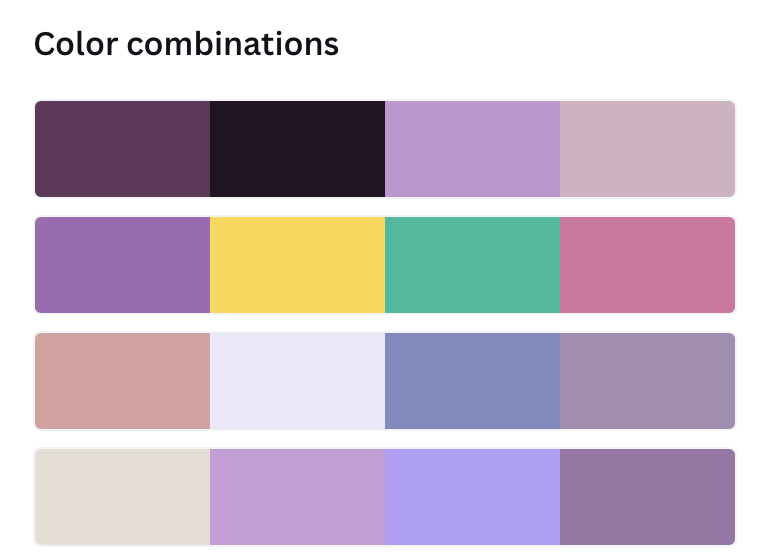
One of the joys of working with rose colors is the endless possibilities for combining and contrasting different hues. Designers often experiment with color combinations to achieve harmonious or dynamic effects. For example, pairing soft pastel pink roses with rich burgundy accents can create a sense of depth and contrast, while blending various shades of pink and peach can evoke a dreamy, romantic ambiance.
Color Conversion
In the realm of design, color conversion is a crucial consideration when translating digital or print designs into physical form. Artists and designers must carefully select color palettes that will retain their vibrancy and integrity across different mediums. When working with rose colors, this may involve adjusting hues, saturation levels, and color profiles to ensure consistency and accuracy in the final product.
Symbolism and Meaning
Rose colors are rich in symbolism and cultural significance, often carrying profound meaning beyond their aesthetic appeal. For example, red roses are universally recognized as symbols of love and passion, while yellow roses traditionally symbolize friendship and joy. By understanding the symbolism associated with different rose colors, artists and designers can imbue their work with layers of depth and meaning.
Drawing Inspiration from Nature
Nature serves as an endless source of inspiration for artists and designers seeking to capture the beauty of rose colors. Whether through plein air painting sessions in rose gardens or botanical studies of intricate petal patterns, creatives find endless inspiration in the organic forms and vibrant hues of real-life roses. By observing and studying the subtle variations in color, texture, and light, artists and designers can infuse their work with a sense of realism and vitality.
In conclusion, the allure of rose colors lies not only in their visual beauty but also in their capacity to evoke emotion, symbolism, and cultural significance. Through the skillful manipulation of color palettes, the thoughtful combination of hues, and a deep appreciation for the natural world, artists and designers bring the enchanting world of rose colors to life in their creative endeavors. As we continue to explore the myriad possibilities of rose colors, we embark on a journey of discovery, expression, and artistic transformation.